.
MoneySuperMarket Broadband
Price comparison web site MoneySuperMarket needed a responsive site that allowed customers to find the broadband package that suits their need quickly and easily.
The brief
I conducted user research to identify customer issues with the existing site. This was used to inform the UX/UI decisions as part of a 7 step test cycle to evolve the site, and creating a future product roadmap. The design goals were to increase the clarity of information presented, providing a clear and easy way to narrow down into a package. Build back the sense of trust and confidence, to make a purchase through MoneySuperMarket.

User research summary
70% of people said the deals weren’t clear enough to help them make a decision to purchase, due in part to the visual language.
100% of people called for clearer language and more detailed explanations of key terms as broadband terminolgy to guide them into better choices.
90% of people wanted to add their own deal information to get personalised results. They had a clear idea of what they wanted but didn't know how to filter out the packages that weren't suited to their partcular need.
100% of people didn’t understand which metrics were used to order the results table. E.G Lowest price, download speeds, provider.
To conclude, all these points combined meant a staggering 80% of people mistrusted what they saw on the site, as it lacked the clarity and transparency they felt was needed to earn their trust.
The site prides itself, rightly, on giving unbias comparison and advice. But due to the combination of these points even recommendtions were seen as adverts that may assumed were paid for placements.
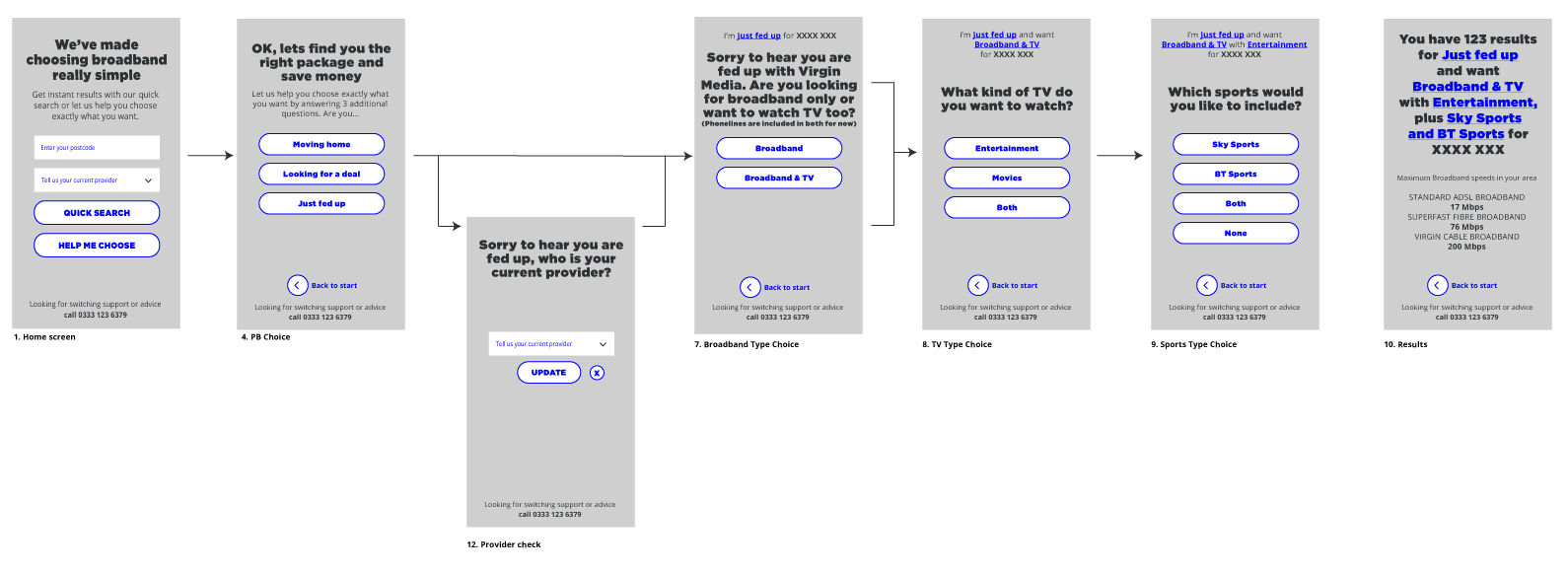
Early stage prototype of a personalised set of results, a desired feature highlighted through the research stage in user interviews.

The solution
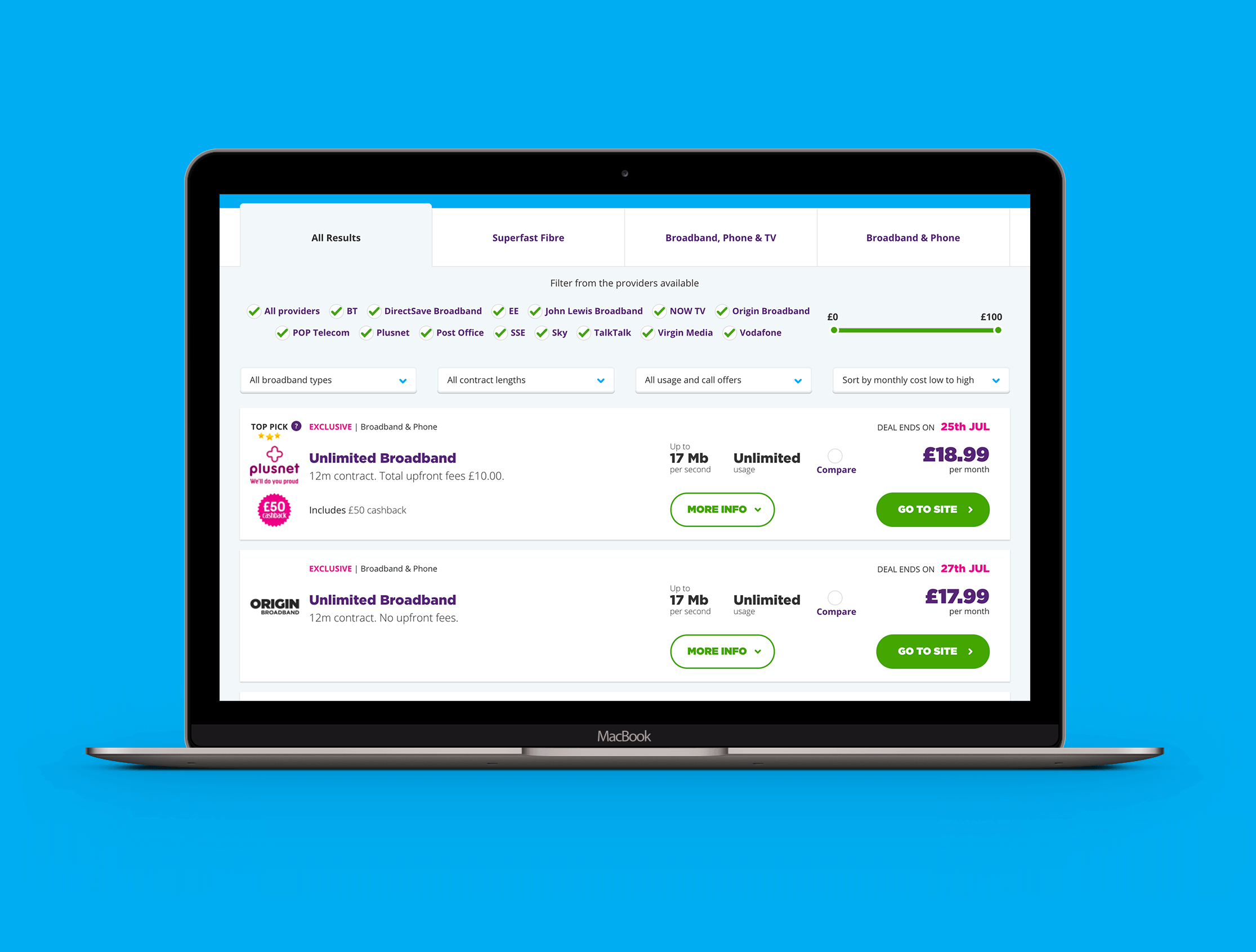
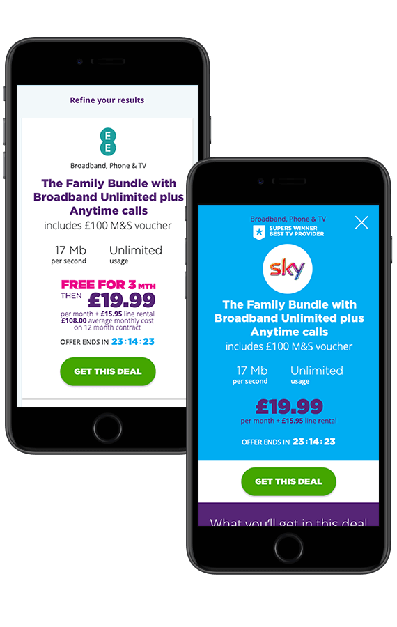
Provide a clear sense of direction to lead customers to a purchase that’s suited to them. Simplify the information presented to show only what’s relevant to customers at the time. This involved removing information or grouping it in a more relevant way.
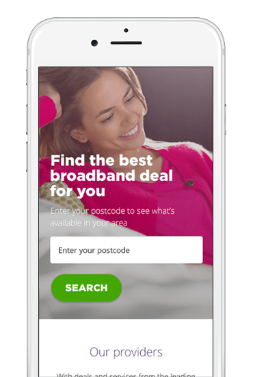
Create an intuitive yet familiar interface that gains customers confidence, thereby increasing trust without needing to say it. Bring the site inline with the look and feel of the brand.


Raise the prominence of content to help explain terminology and key terms and raise organic SEO rankings. Create content guides to educate customers on the newer providers that they are unfamiliar with, to increase the level of trust and confidence in their service.
Surface the comparison list functionality to allow customers to truly compare deals. Create a broadband package builder that gives customers personalised results, to compliment the existing search journey.
The results
The new site launched the first test in August 2015. Through the testing cycle the NPS score grew 25 points. YoY revenue grew 41%, achieving a 97.5% gross margin.
